Just like how we look back on clothing and hairstyles and have a “What was I thinking?” moment, home designers have been known to put out some duds throughout the years.
If you want to make sure that your home looks great, fetches a nice return, and is conducive to modern day family needs, you will want to be cognizant of what type of design to consider for your space. We’ve put together some not-so-great interior designs of all time, so that we can inspire you on your next home project, or help you avoid some of these mistakes.
1. The One Bathroom House
If you currently have or want to have multiple people in your household, you will need more than one bathroom–simple as that. However, decades ago homes were built based on what was required at the time – smaller closets, smaller bedrooms, one bathroom, narrower footprint, etc.
Having only one bathroom is the most inconvenient, especially if there are a few members of your family. This will only cause you to have discomfort and unnecessary planning and plotting in your home. Moreover, this poor home design will damage the resale value that you have, since people swoon over multiple bathrooms in a home.
If you’re not in any position to add a 2nd bathroom in your home, look into expanding the existing one. By expanding your bathroom, you can include features such as a double sink or a larger bathtub or shower space to accommodate multiple people.
You can also incorporate luxurious features such as a chandelier, granite or marble counter top, or a vintage claw foot bathtub so that whenever you’re in the bathroom, you feel pampered. Essentially, the luxuriousness of it can make up for the fact that you only have one bathroom.
2. Stairs Right At The Front Door
This was a popular design in prior decades. Basically, the main staircase appears right at the front door, so it is the first thing that someone sees when they enter your home. This is not appealing, because it takes away a welcoming atmosphere that denotes space and freeness. Also, would you want to climb a flight of stairs right away after you enter? It’s an inefficient and inconvenient design that must be avoided.
One important design to minimize the obtrusiveness of a staircase at the entryway is to paint it the same color as your walls so that it blends in, and not stand out.
3. A Poor Amount Of Natural Lighting
With any type of space that you decide to make your “home”, you need to make sure that it has enough windows to maximize the amount of natural light coming in. Not only will lots of windows allow you to take in a great deal of light, your home will also provide a warm and natural vibe. Further, this will allow you to save money on your electric bills, since you do not always have to be using electrical lighting to illuminate your home.
In addition, if you’re stuck with a home with a small number of windows, make sure that you incorporate design principles to maximize light and airiness in a space such as using lighter paint colors, positioning mirrors to reflect and amplify the natural light from your windows, and ensuring you don’t put anything in the way of the windows so that the sunlight isn’t blocked.
4. Not Enough Bedrooms
Imagine having a home that doesn’t have enough bedrooms for each of your kids? Again, this design was popular in our parents’ and grandparents’ time. This is evident in a lot of the older homes, and typically developers today add a couple of bedrooms to accommodate the present time family.
Investigate areas of your home where you can add or convert into sleeping space – the attic, basement, garage, etc.
5. No Storage
Keep in mind that just because you have rooms and space doesn’t mean that you’ve got it made. You need to be sure that your home comes equipped with plenty of storage space as well.
Ample storage will allow you to make the most out of your home, so that you can continuously grow, without having to worry about clutter. A home design with little storage, whether it’s a closet in the bedroom, or cabinets in the kitchen, will certainly present an issue, especially with our obsession with things and stuff.
Our recommendation is to have multi-functional furniture and home design features – a bed with built-in storage, a staircase with pullout drawers built in, or even building storage underneath the stairs.
6: Bathroom is in an Inconvenient Place
There are some homes that only have bathrooms inside of bedrooms, so that you can only access it by going through the bedroom. Some other homes have bathrooms outside of bedrooms that are only upstairs or downstairs, which makes it inconvenient for anyone who happens to be on the opposite floor during that time. In order to make sure that you are able to have you and your guests accommodated, make sure that you implement a design where the washrooms and bathrooms are positioned appropriately.
If your home allows for two bathrooms, lets say in the case of a 3 bedroom and 2 bathroom house, make one a master suite and the other located in between the other two bedrooms.
7. Little To No Yard Space
There’s nothing worse than having a huge house but no outdoor space. I’ve been in many homes where the physical house takes up the entire footprint, which leaves very little room for outdoor living.
If you’re married to your abode, which has no backyard, look into adding deck space – perhaps a deck off of the kitchen, a bedroom, or even on the roof.
8. Cheesy, Bold, Outdated Fixtures and Design
The good news is that modernizing a home with outdated fixtures is less expensive to do than having to make structural changes, like adding a bedroom.
As homeowners, we’re also interior designers at heart so we like to make a stamp in our interior space using the home trends at the time. Some things that come to mind are:
- Parquet flooring (although to some, this is a timeless design)
- Popcorn ceiling, my personal pet peeve
- Kitchen cabinets using particle boards and plastic or cheap handles
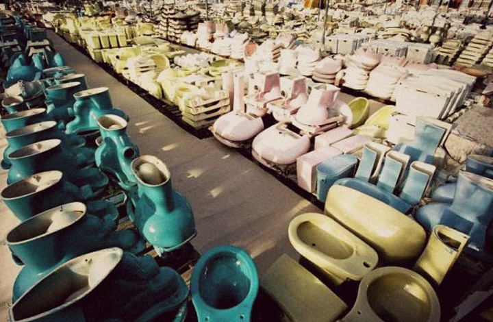
- Avocado colored toilets and bathtubs
- Lime green and neon yellow paint colors on the walls
The above can be easily corrected by: re-painting your walls, replacing your toilet and bathtub with a modern version, and perhaps refinishing your parquet floor. Flattening the ceiling can be a difficult task, but if you’re not up to it, just make sure it’s painted in a light color so that your eye is not drawn to it. Here’s another way you can transform your popcorn ceiling.
9. Enclosed Space
In older homes it is very common to see rooms divided by walls, which may have had its purpose at the time, but today this design can be suffocating. Especially when your home’s square footage is already tiny, the last thing you want is to close up the rooms, which will emphasize its small footprint.
Opening up the space by removing walls can make a huge difference in the look and feel of your home. By having an open concept design, it tricks the eye to perceive the space as larger than it actually is.
10. Unfinished Basements
You may appreciate a fixer upper, but a home has a lot more value and practical use when the basement is already finished. It allows you to use it for any purpose that you want, including another bedroom or an apartment suite.
Finishing a basement can be an expensive project, especially if you need to underpin it first, but the benefits such as an added space and additional income can outweigh the costs.


